Google I/O 2024 Mobile Design
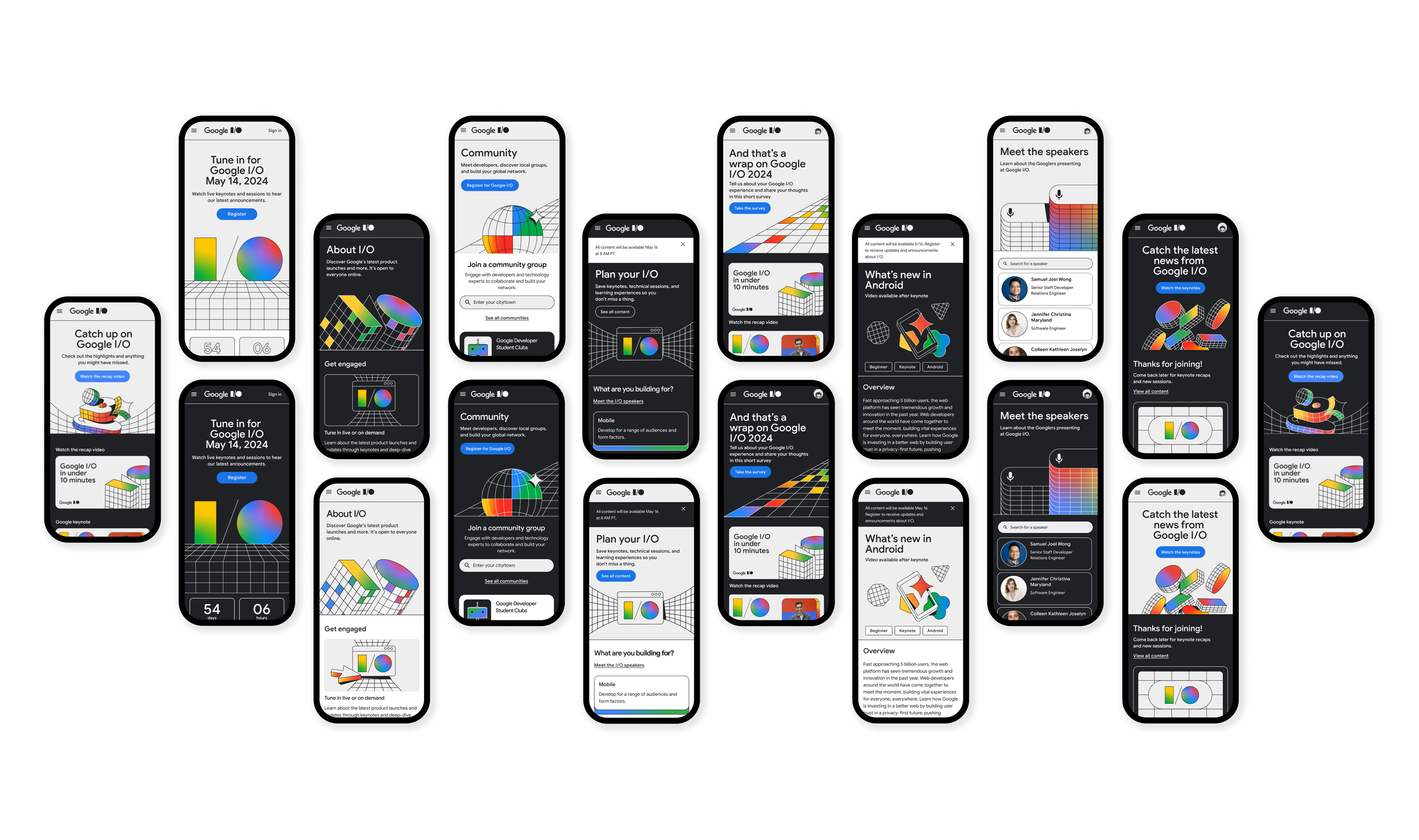
Google I/O is an annual developer conference held by Google which requires a complete site update for developers to register and have the ability to view different types of content such as live streamed keynotes, learning material and speaker information.

Creating a fresh new look and building out user experiences across 5 launch phases for users to access different types of content.
Goal:
Project duration:
6 months
Converting finalized desktop designs and user experiences into high fidelity mobile friendly designs
My role:
Software:
Figma
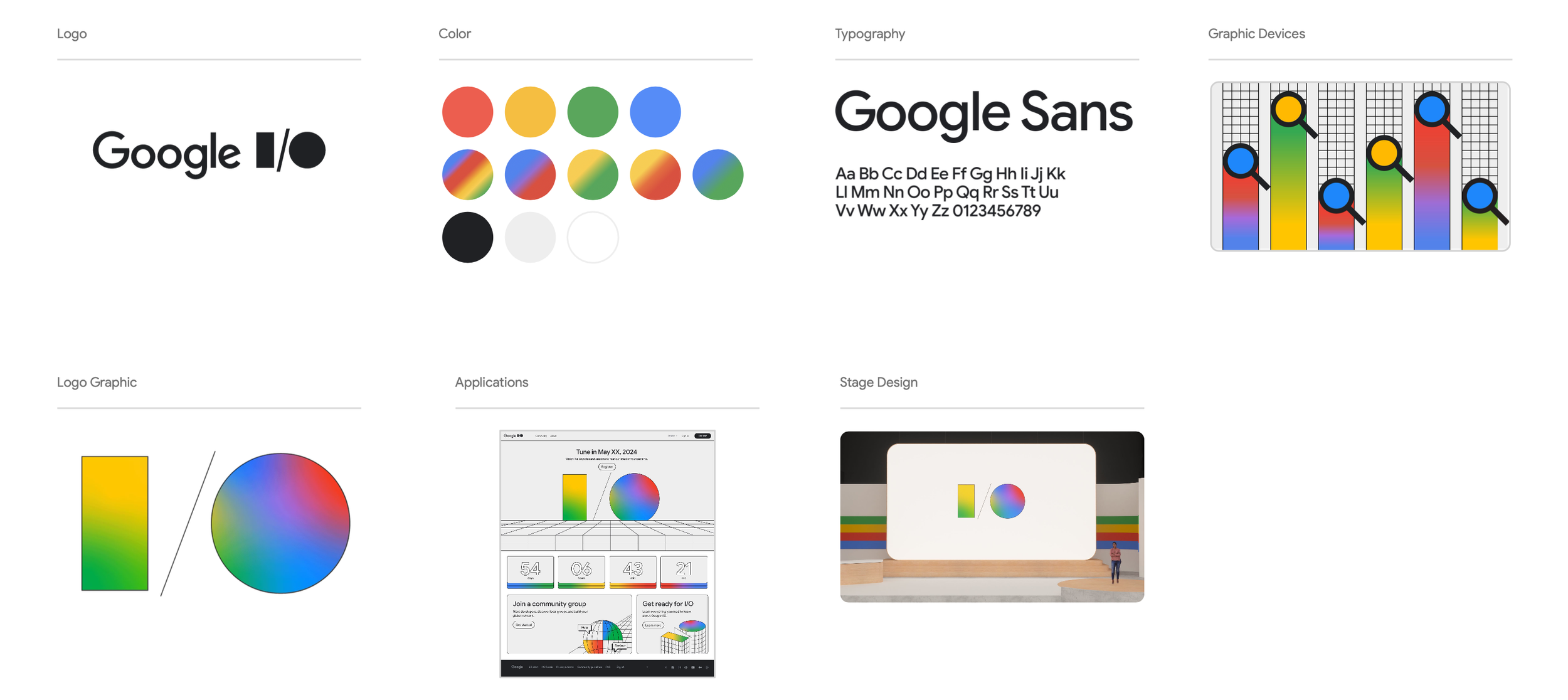
Brand guidelines:
Graphic illustrations and style guide were designed by other team members responsible for brand components. This ensured that we were able to maintain a consistent style and have easy access to graphic elements we can modify throughout the process.
Starting point:
Reviewing brand guidelines and project deck to understand different launch phases that will need to be built out. Creating mobile size components out of desktop designs for a more efficient process and collaborating with the product designer on final pages that are ready to be converted to mobile designs.
Homepage
Desktop page designs referenced to create home page designs from launch 1-5 and to build out the registration process.
Click rate of the button to register is extremely low at only 15% click rate
Problem 1:
The black color button isn’t looking like a button to the users so it was tested out with a blue color instead. After the switch there was a 90% increase in the number of clicks to register.
Solution:
Mobile homepage design
Desktop homepage converted to a mobile size experience to enhance content visibility that is easy to scroll through
Registration process
Mobile designs created to show the registration process and adding new button color updates to encourage users to take this step.
Community page
Page designed to connect users to the developer community
Signed in, unregistered
Signed out, Unregistered
Page modals
Page modal designs to prompt users and provide confirmation for different types of actions.
Thumbnail graphics will take up too much space on mobile when they are kept the same size as the desktop version.
Problem 2:
Creating smaller image thumbnails for the graphics and removing it off of the ones that need to focus more on the copy.
Solution:
Community page mobile designs
Mobile page modals
Explore page
This page gives the users the ability to save keynotes and technical sessions so they don’t miss events and get the opportunity to learn
Keeping filter sections on the page were adding too much clutter to the mobile view.
Problem 3:
Adding a filter button instead to tuck away them away and let the menu slide out from the left made it more mobile friendly.
Solution:
Explore page mobile designs
Speakers page
Page created to help users find Googlers that will be presenting at I/O
Googler cards need to display on mobile without taking up too much space that causes too long of a scroll to find a speaker.
Problem 4:
Cards are condensed to a horizontal layout for minimal space used and more cards can be displayed at once which gives users the ability to find their speaker faster.
Solution:
Speaker page mobile designs
Speaker details Page
Page created to help users get more information on the speaker.
Profile image of the speaker needs to fit the mobile size header without running into the text or being too small to see.
Problem 5:
Keeping the image on the right side so it does not run into the text and allows more room on the left side for copy and buttons while keeping a visible size image of the speaker.
Solution:
Speaker details page mobile designs
About + FAQ Page
Helps the users find information about the latest product launches
Desktop filter chips need to be added on mobile in a condensed and simplified way
Problem 6:
Filter chips have been added as a horizontal scroll to make it easy to access and scroll though on mobile without taking up extra space.
Solution:
About + FAQ page mobile designs
Final web and mobile site
End result:
Developer starts QA process with one launch at a time to covert designs into a live site, this ensured the functionality was taken into account and all design issues were addressed.
Design process among the team could have been done more efficiently using more Figma features such as the process of converting light mode designs into dark mode.
Reflections:
Content changes caused inconsistencies in designs, we could have used more components to ensure changes were reflected everywhere so they are not missed or finalizing content sooner.
Using accurate navigation bars for appropriate login and registration states in the mockups to ensure the page view is showing correctly and causes less confusion on page states.


