Twitter Spaces Page & App
Twitter spaces site and app built with the developer community in mind, providing a convenient hub for discovering and engaging with Twitter spaces. This is a seamless and immersive experience that brings the developer community together in one place.

Creating a space for the developer community to connect in a different way, host a place for Twitter spaces and remind users of upcoming events
Goal:
Project duration:
4 weeks
Designing a single page and mobile view from start to finish in Figma. Providing design direction and feedback for illustration designers to build assets. Collaborating with the project manager for additional design feedback. Working with the web developer for the QA process to ensure that the live site matches with the design.
My role:
Software:
Figma
Starting point:
Considering various attributes and exploring simple ways to facilitate access to content that will be important to the user. I started by sketching different layouts, components and solutions to display content that will make it easy to access in one platform.
Separating upcoming events in a way that gives them priority and more attention from the users.. Also, giving users the ability to schedule reminders for when upcoming spaces become available.
Problem 1:
Showcasing all upcoming events at the top of the page so it is the first thing the user can see. Also, providing an “add to calendar” feature to give the user the ability to schedule reminders so that they don’t miss anything.
Solution:
Implementing a user-friendly filtering system that will optimize content organization.
Problem 2:
Using a tab system that will make it easy for users to filter content
Solution:
Featured section
Highlights specific spaces that are new or popular as a carousel so users will not miss it.
Carousels have been user tested and proven to be a bad user experience since it causes them to miss content that is important.
Problem 3:
Removing the featured section completely since it is not needed, it can be displayed in the “Upcoming Spaces” section.
Solution:
Enable users to listen to past spaces, providing them with the ability to access and engage with previously conducted events.
Problem 4:
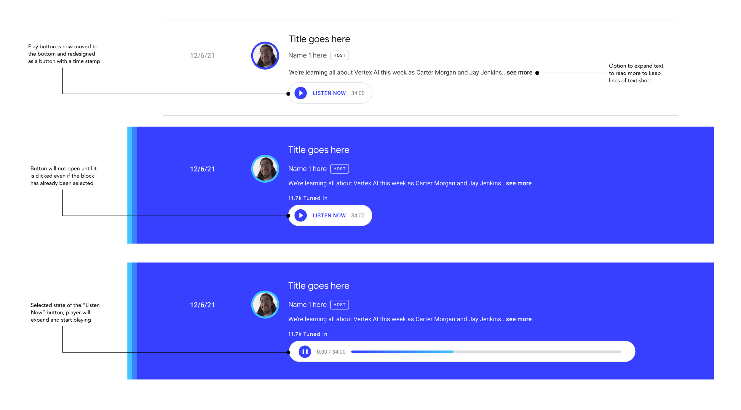
Past spaces section works as a playlist for users to easily play a past space within the page to keep it simple and serve the purpose of being on this page. Additional filtering was not needed, keeping it straight forward makes it simpler to navigate and creates less clicking to find content.
Solution:
Wireframe options:
Incorporating components designed into wireframe explorations to bring forward easy navigation and features that will make it easy to access content in one platform.
Challenges:
Tab filtering menu does not offer specific filtering selections that will be commonly used and will require a different approach
Audio player needed a more seamless process of viewing information and opening the player to listen.
Utilizing different colors from the brand guidelines that will tie it into Google branding as well.
Style guide:
Google branding guidelines and Web.Dev
Google Sans
Roboto
Revised upcoming spaces:
As a result of resolving the issue of creating a better filtering system, I had utilized filter tags that users would commonly look for to bring forward relevant upcoming spaces cards upon selection.
Revised past spaces player:
To make the player more seamless I decided to give the user more control. The tab will not automatically play the audio once it has been selected, instead the user can select additional states to view more text or click into the audio player to start playing when clicked upon.
Final wireframe:
Final wireframe had been created to show different sections to organize information and have updated components. Color had been changed from purple to blue tones instead to add that Google brand style into the page.
Problem:
New content informs that there will not enough featured spaces content available on the site to require filters for organization.
Solution:
Since there is not enough content, filters will be completely removed to keep the page clean and simple.
Limiting cards to show three of the most recent spaces instead of a long list of cards all at once. Providing a button instead to keep the page minimal and clean.
Top three cards:
Revealing more cards upon click of the “view more” button as a way to still keep multiple cards in the upcoming spaces section and provide a. use case if more than three upcoming spaces were to be displayed.
Collapsed cards:
Final website:
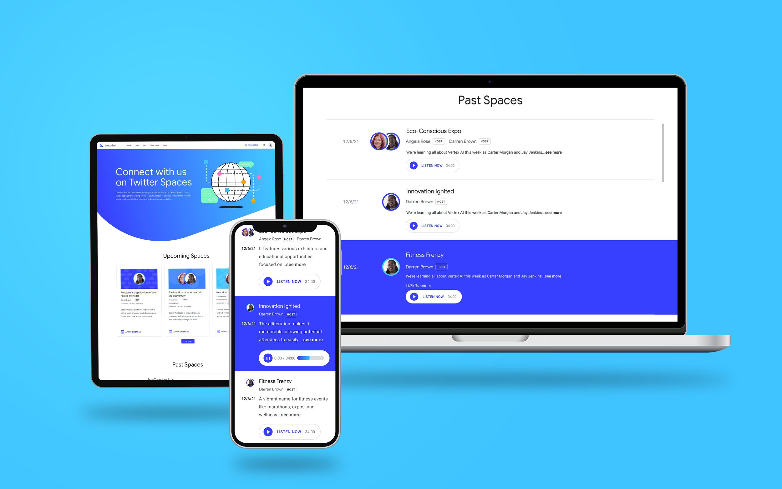
Final high fidelity design came together after resolving different component and functionality issues on the page.
Final mobile design:
Mobile designs were created according to the desktop layout and within the constraints of the mobile developer capabilities.
Jump down menu
Navigation links added at the top to let users skip ahead and ensures that they do not miss additional content that is available under the first section.
Single cards
Single cards used for mobile design to make content easy to read and keep layout similar to the desktop version.
Audio player
Same audio player designed for mobile size to make the user experience similar to the web version so that it is easy to navigate and familiar for the users.
Q & A was conducted with developer to finalize site on staging which then was launched to the public for developers to use.
End result:
Calendar reminders can give the option to link to personal calendar so the users can get reminders outside of the page.
Reflections:
Featured spaces can be limited to top 3 for hierarchy so additional spaces don’t lose visibility being hidden under a button.
Connecting with developers earlier in the design process to discuss their constraints and capabilities to avoid having issues when the final design is ready for QA.


